My Rating: 7/10
My Thoughts: I am not usually into such funky colors but they sort of went with the photo of the sunset I used (taken by me).
|
PAST LAYOUTS |
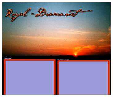
Version 1:
My Rating: 7/10
My Thoughts: I am not usually into such funky colors but they sort of went with the photo of the sunset I used (taken by me).
Version 2:
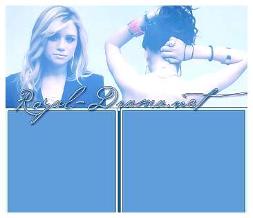
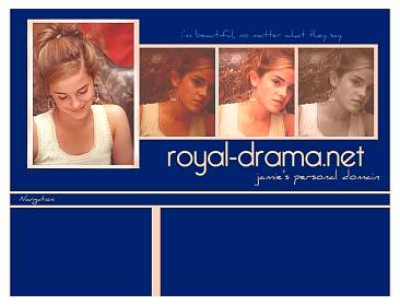
My Rating: 9/10
My Thoughts: Blue is my favorite color and I adore this photo of Mary-Kate & Ashley Olsen. Plus I love the font the site name is in.
Version 3:
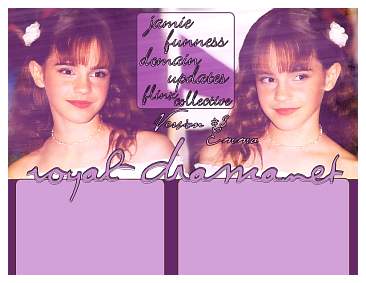
My Rating: 7/10
My Thoughts: I like the purple shades and all the effects I did.
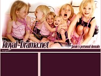
Version 4:
My Rating: 4/10
My Thoughts: This one never made it up because I didn't think people would want to stare at my faces, ha!
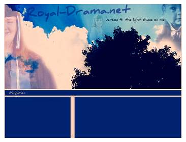
Version 4.1:
My Rating: 9/10
My Thoughts: I was just playing around and I came up with this. I wanted to keep the same colors as the layout before so I wouldn't have to re-code all the colors. I ended up really liking it.
Version 5:
My Rating: 7/10
My Thoughts: I wanted to work a bit on my blending and I wanted to use these photos for ages. I love the color combos.
Version 6:
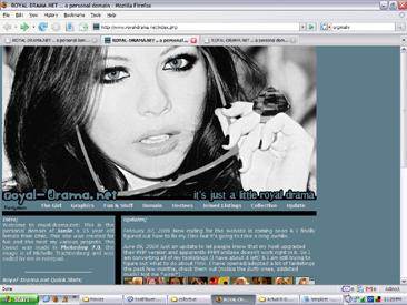
My Rating: 6/10
My Thoughts: I wanted something dramatic to go with the site name. I like the black & blue combo with the randomly colored black & white photo.
Version 7:
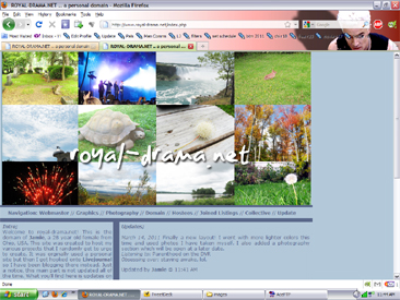
My Rating: 9/10
My Thoughts: I was really into this style and I really liked colors together.
- back one